Skandif
Dignify your Working Space
Brand Identity | Brand Guidelines | Packaging
Skandif is a self-manufacturing brand known for its exceptional woodworking craftsmanship. In this branding project, our goal is to establish Skandif as the top choice for those seeking to enhance their workspace with high-quality wooden desk accessories.
The Discovery
Discovering Skandif’s ideal audience and their preferences.
Understanding Skandif's ideal demographic was crucial for shaping the brand's future direction. We conducted thorough research into the preferences of those who value wooden desk accessories.
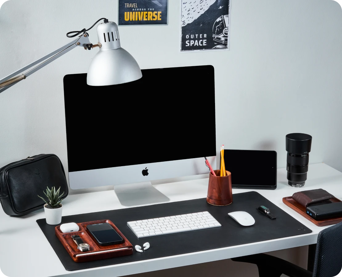
Skandif target audience has a distinct preference for a minimalist, luxury urban style in their workspace setup.
The Strategy
The Research
Portraying Quiet Luxury.
With this insight, the strategy is to showcase a sense of quiet luxury that appeals to Skandif's target audience.
The goal is to deliver a premium brand experience that goes beyond just visuals and product quality – from the moment they make a purchase, throughout the unboxing experience, and while using Skandif products.
The Design
The Art of Craftsmanship.


Forest-Inspired Brand Experience
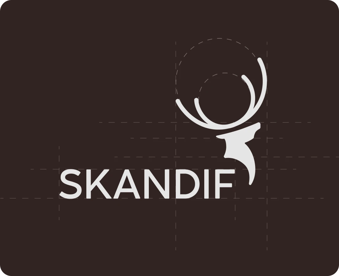
Following the logo design, we enhanced the brand experience by creating elements inspired by the forest, the natural habitat of white-tailed deer.
Skandif’s audience appreciates a quiet luxury aesthetic and prefers refined branding with darker colors. To reflect this, we chose forest-inspired colors: deep pine green, dark brown of tree barks, and neutral ivory reminiscent of stepping stones.
The Implementation
Communicating as Skandif.
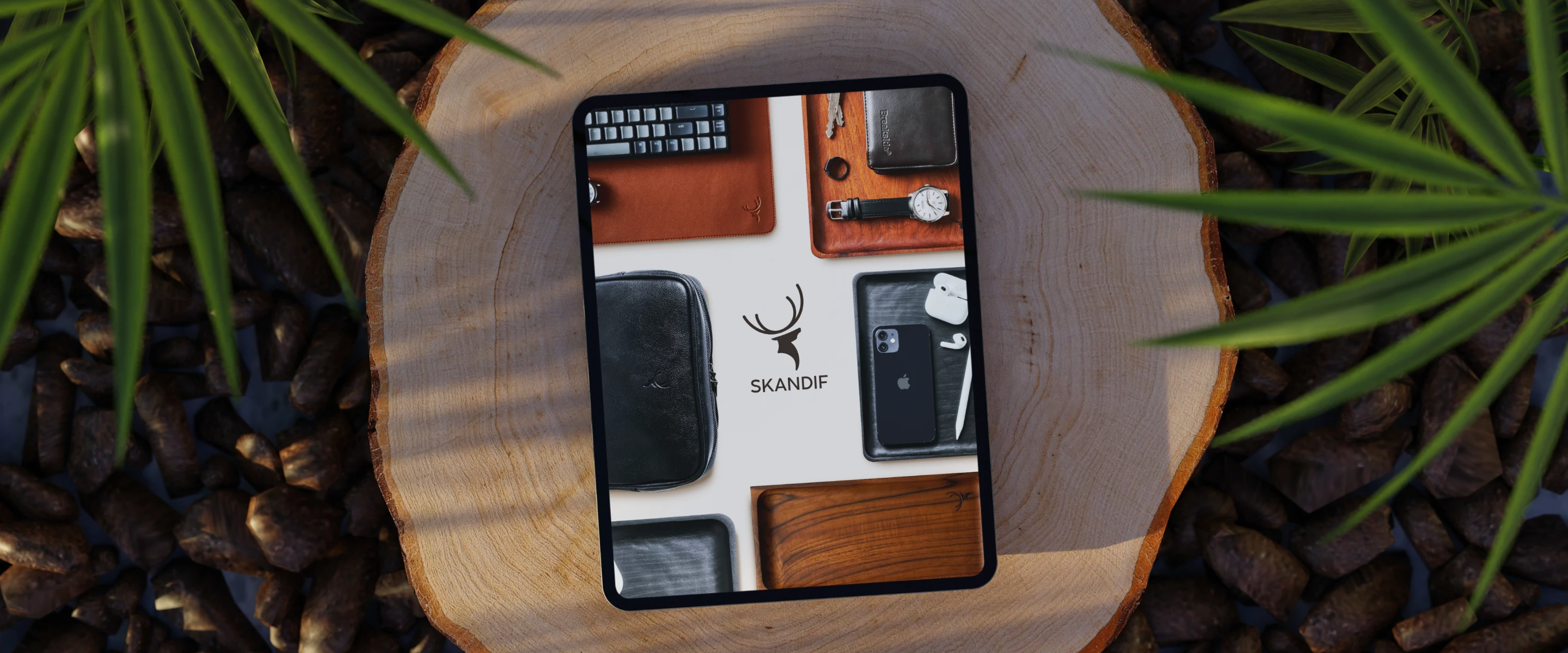
As part of the brand strategy, the brand collaterals are designed according to brand guidelines to match Skandif’s target audience’s refined tastes and lifestyle.
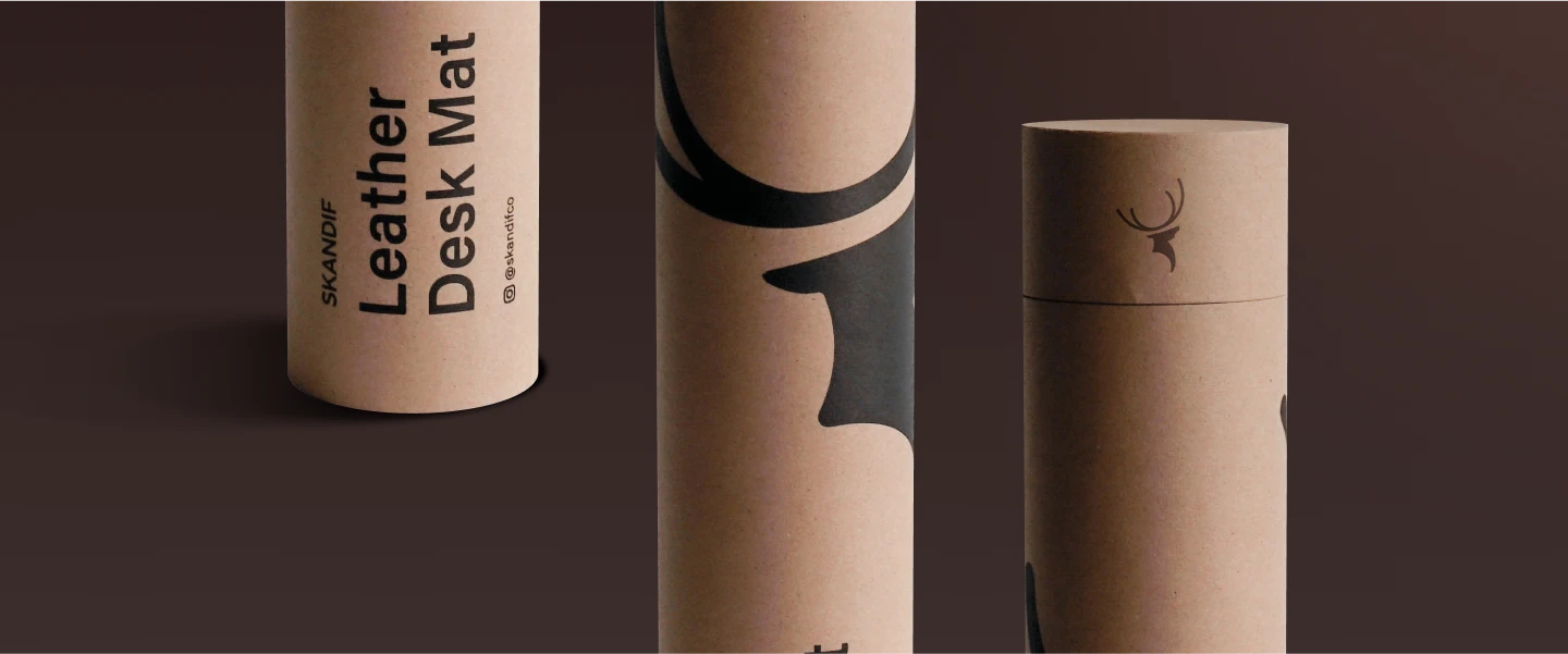
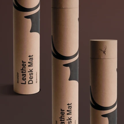
As part of the brand strategy, the brand collaterals are designed according to brand guidelines to match Skandif’s target audience’s refined tastes and lifestyle.
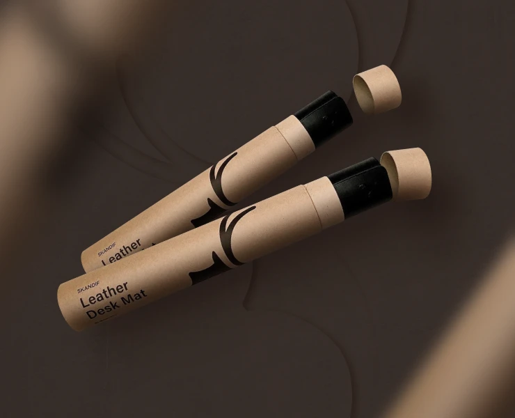
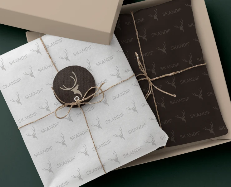
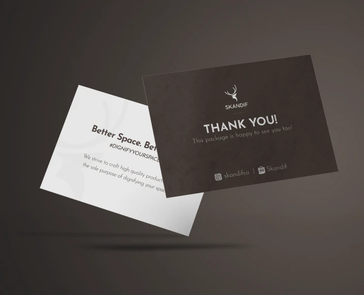
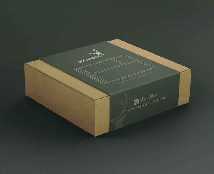
Sustainable Design
Skandif’s packaging design is rustic and polished with a touch of exclusivity. This design reflects the style of young male professional who leads a minimal luxury lifestyle.
.png)
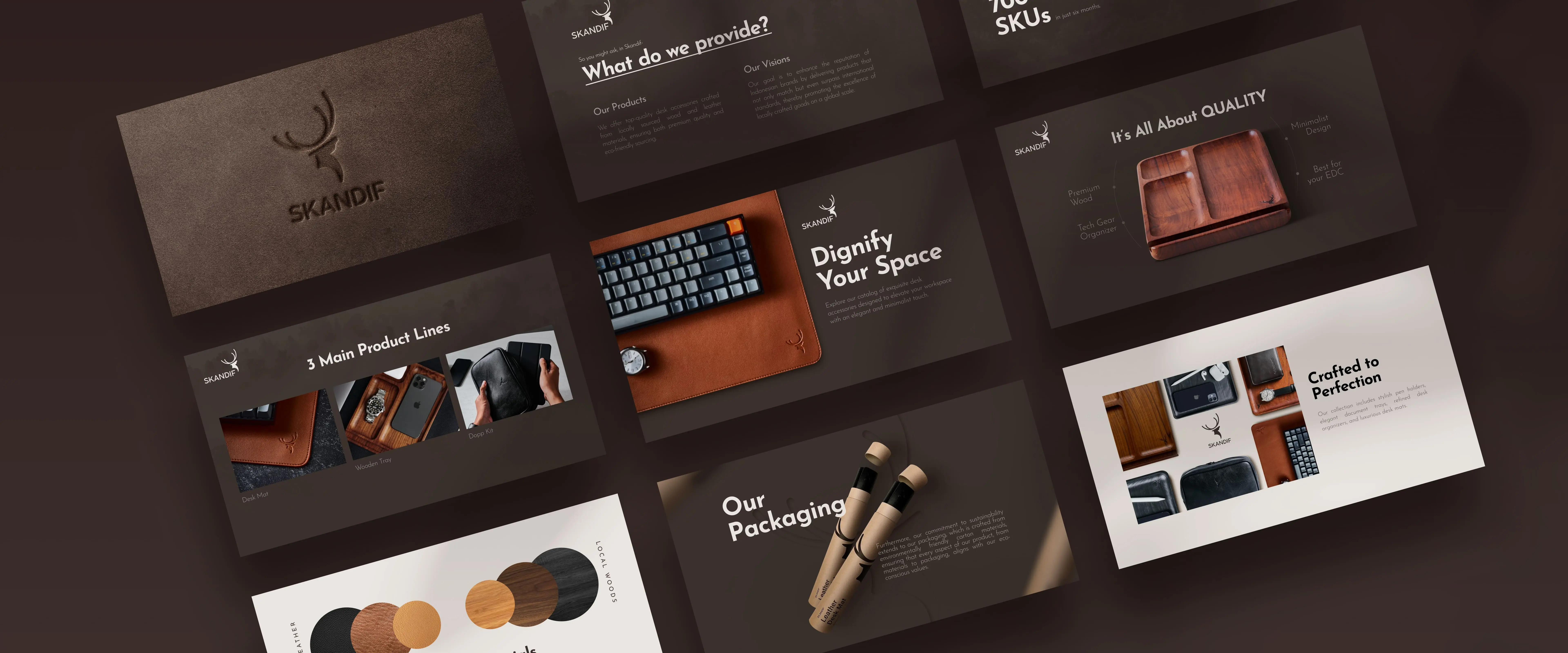
Representing Lifestyle
As part of the brand strategy, we introduced a quiet luxury concept to reflect the style of a young male executive who embraces a minimal luxury lifestyle. The brand collaterals are designed according to brand guidelines to match their refined tastes and lifestyle.
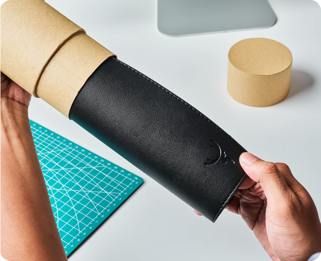


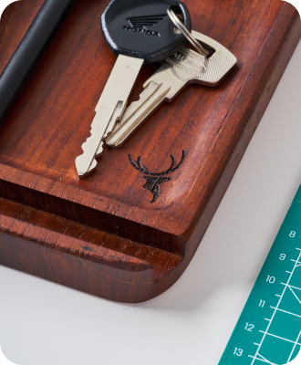
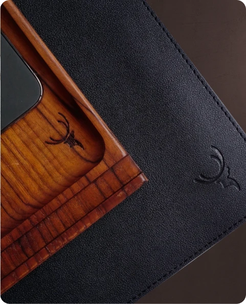
Engraved in Nature
The logo is designed to be adapted to various materials used in Skandif’s products, aligning the brand to its forest-inspired theme.

