RateS
RateS
Onboarding Screen Project
Collateral Designs | Product Strategy | Animation
RateS is a social commerce app designed to help new entrepreneurs kickstart their online businesses as resellers. In this project, we focused on revamping the app's onboarding screens—enhancing the visuals, refining the copywriting, and optimizing the strategy to boost user completion and conversion rates.
RateS is a social commerce app designed to help new entrepreneurs kickstart their online businesses as resellers.
In this project, we focused on revamping the app's onboarding screens—enhancing the visuals, refining the copywriting, and optimizing the strategy to boost user completion and conversion rates.
.webp)
.webp)
The Discovery
The importance of onboarding screens.
Onboarding screens are a series of strategically arranged screens designed to introduce app features concisely, helping users understand how the app works and what benefits it offers before they sign up.
By guiding users from the start, onboarding screens increase the likelihood of user engagement and retention,
which determines the conversion rate of the apps as the main KPI.
.webp)
The Discovery
The importance of
onboarding screens.
.webp)
Onboarding screens are a series of strategically arranged screens designed to introduce app features concisely, helping users understand how the app works and what benefits it offers before they sign up.
By guiding users from the start, onboarding screens increase the likelihood of user engagement and retention, which determines the conversion rate of the apps as the main KPI.
.png)
.png)
The Research
Why current onboarding
screens don’t work.
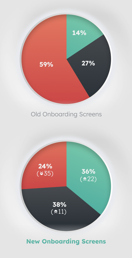
We did a user testing on the old onboarding screens to assess the overall results based on the app’s conversion and drop-off rates. Based on our testing, we found that the current onboarding screens were not effectively achieving this goal.
The current onboarding screens are ineffective because they require users to click through four steps, with an option to skip the process entirely. This leads many users to skip the screens, leaving them unclear about the app's purpose and features. This lack of understanding causes confusion, leading to a higher drop-off rate.
The Strategy
Static Images vs Animation.
To keep users engaged and reduce drop-offs, it’s important to simplify the onboarding process and deliver key information through a more engaging medium like animated screens. Animation creates a more immersive experience than static images, capturing user attention and engaging them more effectively.
.webp)
The Design
Static Images vs Animation
To keep users engaged and reduce drop-offs, it’s important to simplify the onboarding process and deliver key information through a more engaging medium like animated screens.
.webp)
Animation creates a more immersive experience than static images, capturing user attention and engaging them more effectively.
The Design & Implementation
The 8-second rule.
We compiled the information from 4 onboarding pages into an 8-second animation. The new animated screen is short and entertaining enough to convey the app's features while still holding the users' attention.
The Design & Implementation
The 8-second rule.
We compiled the information from 4 onboarding pages into an 8-second animation. The new animated screen is short and entertaining enough to convey the app's features while still holding the users' attention.
Revamp Results
Revamp Results
.webp)

.webp)
Frame 1
Select Product
This frame introduces the first action in the app: selecting the products users want to sell.
Frame 2
Sell Product
This frame indicates that the app is a reselling platform where you can set your own profit margins before selling.
.webp)
.webp)
Frame 3
Earn Profit
This frame is designed to entice users by demonstrating the potential profits they could earn if they choose to sell with the app.
.webp)
Frame 1
Select Product
This frame introduces the first action in the app: selecting the products users want to sell.
.webp)
Frame 2
Sell Product
This frame indicates that the app is a reselling platform where you can set your own profit margins before selling.
.webp)
Frame 3
Earn Profit
This frame is designed to entice users by demonstrating the potential profits they could earn if they choose to sell with the app.
.webp)
.webp)
Before
.webp)
After
Improved copywriting & CTA
The improved CTA screen is less ambiguous and more concise. The new copy further appeals to the user’s needs and persuades them with app’s purposes, before ending it with strong CTA to start a reselling business.