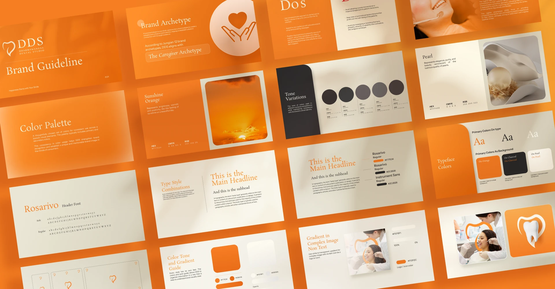
Dharmawangsa Dental Studio
Happiness Starts with Your Smile
Brand Identity | Brand Guidelines | Communication & Strategy | Company Profile
Dharmawangsa Dental Studio is a South Jakarta-based dental clinic that prioritizes high quality dental and oral care to support oral health journeys for families.
The rebranding goal is to enhance DDS brand identity to modernize the visual identity and to resonate more effectively with its core values.
The Discovery
Communicating value through rebranding.
We had the chance to meet DDS team in person and discuss their vision for this rebranding project. DDS is committed to offering a premium dental experience that goes beyond traditional dentistry.
"We want to ensure that the moment our patients step into the clinic, they'll be greeted with a warm, inviting atmosphere to make them feel at ease."
The Research & Strategy
Re-building DDS' brand foundation.
After understanding the brand value that DDS aims to communicate, we began
by identifying several keywords that best represent them.
We further develop DDS' brand value into a brand essence and actionables to solidify their
foundation and positioning.
The Research & Strategy
Re-building DDS'
brand foundation.
After understanding the brand value that DDS aims to communicate, we began
by identifying several keywords that best represent them.
We further develop DDS' brand value into a brand essence and actionables to solidify their
foundation and positioning.
The Design
Premium dental experience, translated into visuals.
Premium dental experience, translated into visuals.
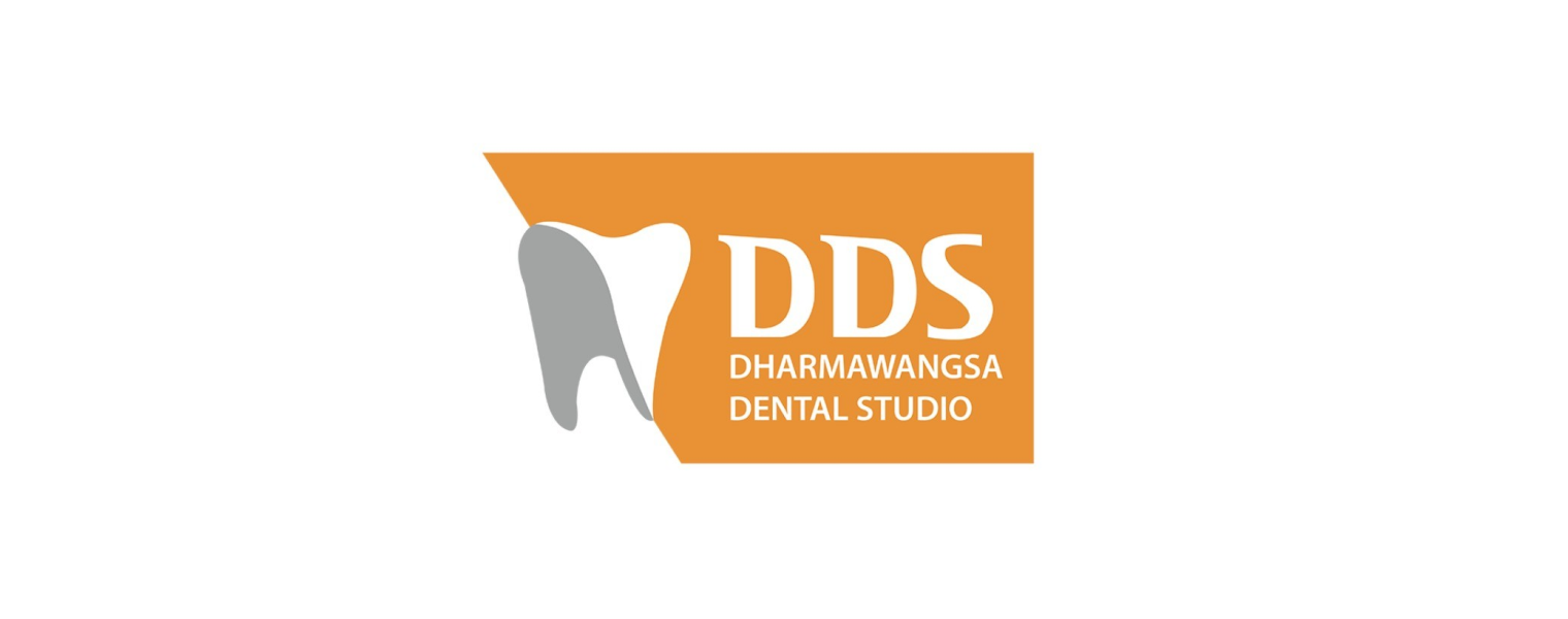
Guided by these brand keywords, we redesigned the DDS logo. Throughout this process, we maintained its straightforward appearance to reflect the dental service aspect while enhancing its minimalistic and premium look.
.png)

.png)
Guided by these brand keywords, we redesigned the DDS logo. Throughout this process, we maintained its straightforward appearance to reflect the dental service aspect while enhancing its minimalistic and premium look.
Our Design
Explorations
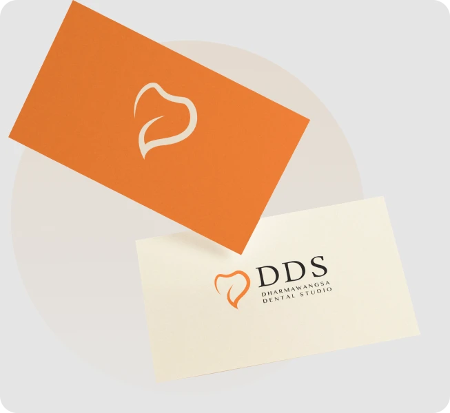
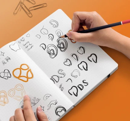
The client aims to redesign the teeth element of their previous logo in a premium, minimalist style that avoids conventional or straightforward designs.

Our Design Explorations
The client aims to redesign the teeth element of their previous logo in a premium, minimalist style that avoids conventional or straightforward designs.

Logo Concept
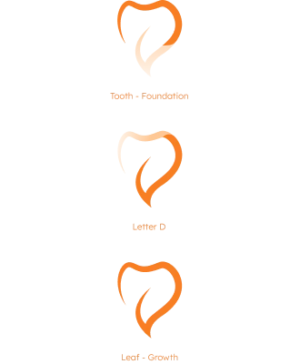
This logo is shaped like a combination of the letter "D" and a tooth, forming its primary structure with sharp and flowing strokes, creating a premium impression without sacrificing its comfort element. With the overall shape being a leaf to signify a growing tooth.



Primary Color
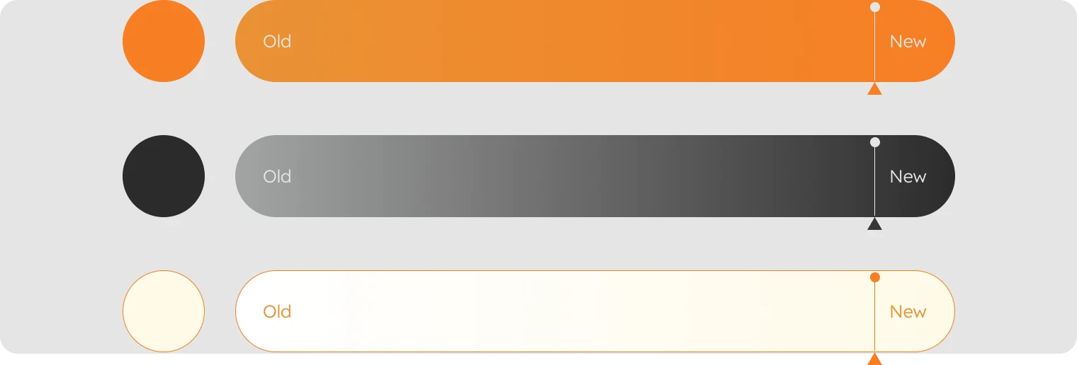
While they prefer to maintain their signature orange hue, they seek for a more refined identity, aiming for a subtler yet more premium style to reflect their premium dental care. We experimented with various orange tones and colors, exploring various logo designs and styles to find “the one” that clicks.
The Implementation
DDS Communicated Through Medium.
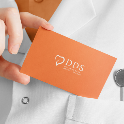
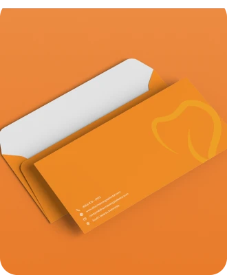
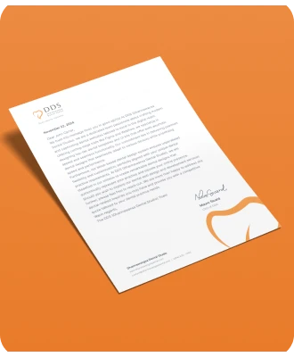
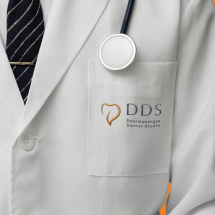
Dental care is more than a routine appointment – it's a long term care dedicated to the patient's comfort, health, and assurance. Therefore, the branding and communication should reflect these values.


